Table of Contents
Resource - Shape
Shape Resources in Total Launcher provide lightweight vector graphics tools for creating scalable UI elements, background containers, and custom button bases. Unlike standard pixel-based images that lose crispness when scaled, vector shapes utilize mathematical rendering to maintain perfect clarity at any screen resolution while consuming minimal system memory. Saved directly within the central resource library, shape assets can be reused across multiple pages and updated globally. Mastering these vector parameters enables the design of modern card layouts, custom borders, and dynamic object masking without external editing software.
What is a Shape Resource?
Total Launcher manages reusable vector assets within a central library accessed via:


Common Use Cases
- Card UI Backgrounds: Creating clean, modern panels behind text or widgets to improve legibility against busy wallpapers.
- Custom Buttons: Combining background vector shapes with text or icons to create tactile, interactive controls.
- Object Masking: Serving as a geometric frame or “cookie cutter” to crop square images into circular or Squircle profiles.
- UI Accents: Acting as dividers, borders, or structural indicators across layout groups.
Built-in Shape Library
Total Launcher includes a core collection of vector geometries:
| Type | Preview | Primary Use Case |
|---|---|---|
| Rectangle | 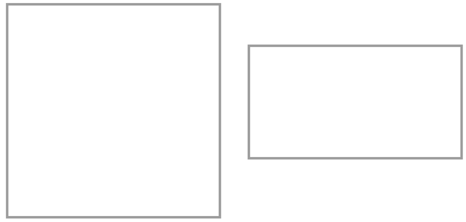 | Sharp 90-degree corners. Ideal for full-screen containers, divider lines, and rigid grid layouts. Resizes freely on the canvas. |
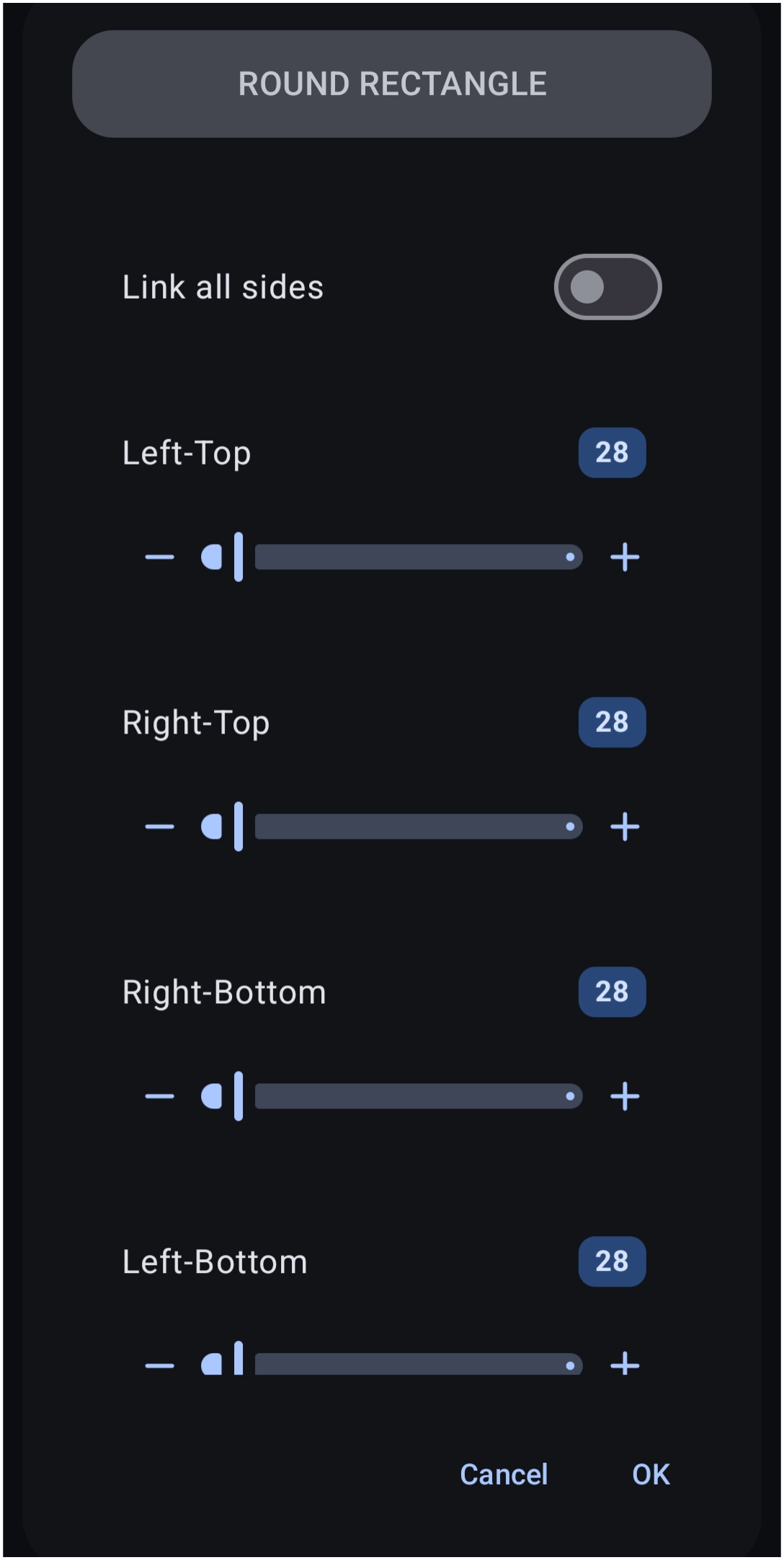
| Rounded Rectangle | 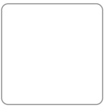 | The primary standard for modern Android design. Ideal for cards, app icon backgrounds, and buttons. Increasing the corner radius beyond `50` transforms the shape into a pill or oval. |
| Oval | 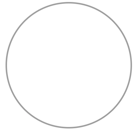 | Automatically forms a perfect circle when width and height are equal, or an ellipse when stretched. |
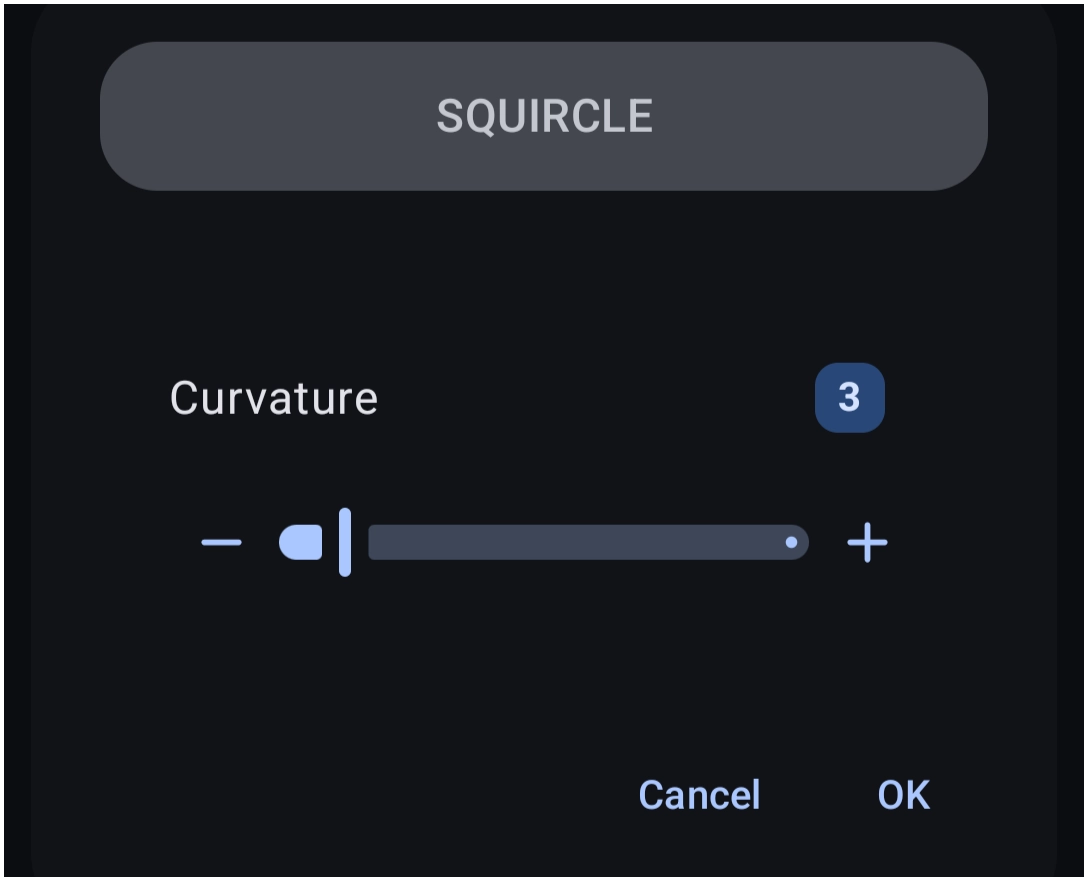
| Squircle | 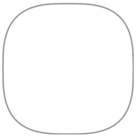 | A continuous hybrid between a square and a circle. Unlike rounded rectangles, squircles feature smooth curvature along their entire perimeter for a modern UI feel. |
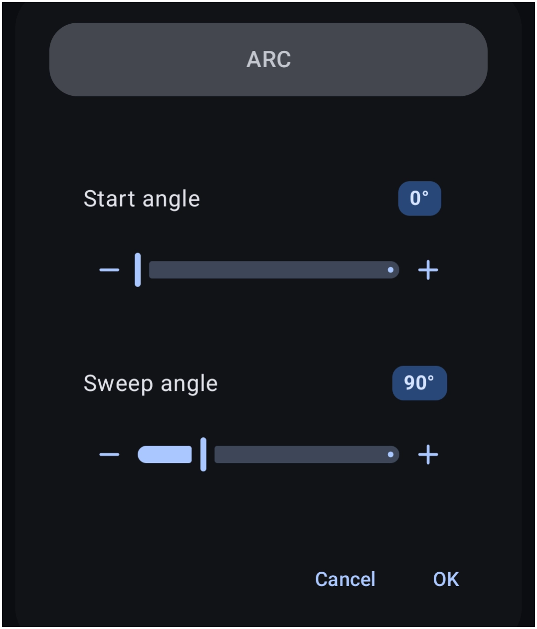
| Arc | 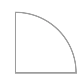 | Generates curved lines, pie-chart wedges, or circular segments defined by start and sweep angles. (See the uiTLM Arc Calculator below for visual angle conversion). |
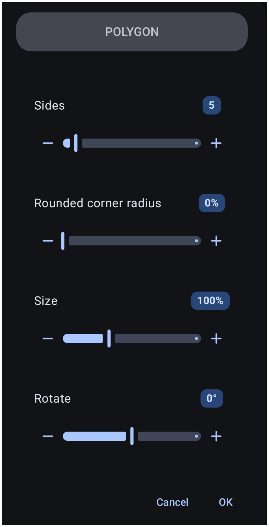
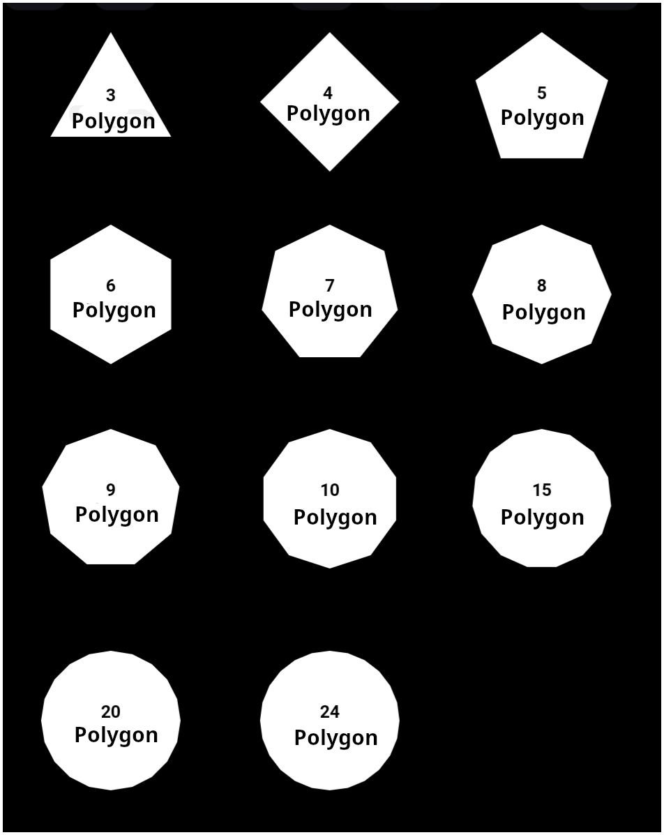
| Polygon | 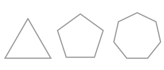 | Multi-sided geometric shapes (3 to 24 sides) such as triangles, pentagons, and heptagons. Excellent for unique navigation keys and geometric accents. |
Basic Shape Creation Workflow
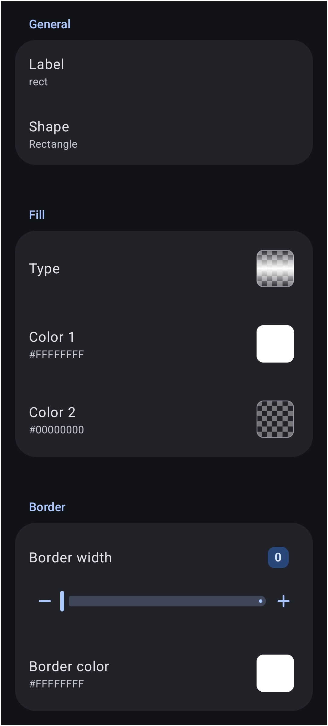
To add and configure a new shape resource:
- Label: Assign a unique descriptive name (use underscores `_` instead of spaces) for identification in the resource manager.
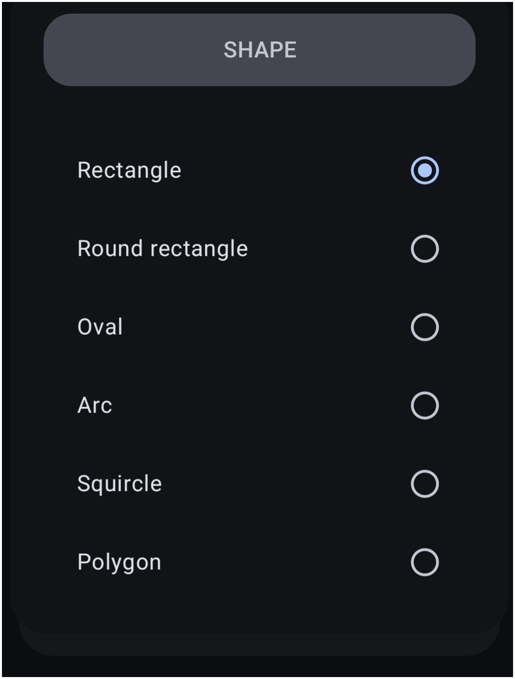
- Shape Selection: Choose the base vector geometry from the library.
- Color 1: Defines the primary fill color (Defaults to `#FFFFFFFF` solid white).
- Color 2: Defaults to transparent (`#00FFFFFF`). Changing Color 2 unlocks 14 gradient shading modes, wallpaper blur effects, and glassy transparency overlays.
- Border Width & Color: Defines an outer stroke along the perimeter (`0` to `288` pixels). Borders use solid colors only (gradients are not supported).
Shape Selection Dialog
 ⬅️➡️
⬅️➡️ 
For detailed instructions on configuring gradients, alpha channels, and hexadecimal transparency levels, refer to the Color Picker Guide.
Advanced Geometry Parameters
Specific shape types provide fine-tuned controls to adjust curvature, angles, and sides. View the dialogs and explanations for these specific shapes:
Practical Application Examples
1. Creating a Card Background
Instead of placing text or widgets directly on a busy wallpaper, apply a Rounded Rectangle shape as a background layer:
- Create a shape with a solid fill (e.g., `#FF1E1E1E` for dark mode).
- Set the corner radius to `28`.
- Place the shape behind a group of widgets or text items to form a clean, readable card.
2. Image Masking (Cropping Photos)
Vector shapes act as a geometric frame or “cookie cutter” for images:
- Select an Oval shape resource.
- Set the image as a mask fill over a square photo object.
- The photo automatically crops into a clean, circular profile picture.
Technical Note on Animated Images: Using a Shape resource mask over an animated GIF will freeze the animation at the first frame. To keep GIF animations active, place the image directly on the page using Add (+) > Graphic > Image (note that shape resources cannot mask direct image objects).
Benefits of Vector Shape Resources
- Resolution Independence: Shapes never pixelate or blur when stretched across high-density displays.
- Memory Efficiency: Machine-readable vector shapes consume virtually zero RAM compared to heavy PNG image files.
- Global Resource Syncing: Because shapes are saved centrally in the resource library, modifying a single shape resource automatically updates every instance of that shape across all pages.
Comments & Feedback
Toby Lancer is ready to help! Look for the Quick Help form:
► Desktop: left sidebar located near the bottom for Private to Admin
► Mobile: 3-bar menu at page top.
► Use the Discussion section below to share any experiences and communications with other Total Launcher users.
► Any Registered User can directly update this and any wiki page if desired.
Moderation: To keep the manual clean, all comments are held for appropriateness review. Preview any comment before submitting it. It will not be displayed after submission until it is reviewed. So, please, do not resubmit.
Formatting: If using any code snippets, place them inside code tags (e.g., 'code') using double single quotes (') before and after to keep them readable.
Be Kind: This is a community effort. Please keep feedback constructive and on topic.
~~DISCUSSION~~